The actual FreeBSD logo

Look at the image I am using for my avatar.
I do like that idea but the question would always be asked as to how that identified FreeBSD. Then the history behind it would have to be explained.

If there was any money behind it, I would re-do the whole site, as others have mentioned. At the same time, I feel guilty for mentioning money.
 
It does look nice but there's quite the backstory behind it and plenty of dependencies to work out before any official changes happen.
I don't doubt. Much work remains to be done before it is fully operational the new website.

Anyway, kudos to the web designer :)
 
Who says we have to have a logo like Linux? We really don't, plus Tux is the symbol for the Linux kernel versus any distro - as one could see. There is no equivalent model for BSD.

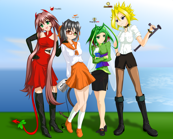
Personally, though, I rather like these designs:
bsd_tan_group_shot_by_deviantos_tans.png


But thats the manga/anime fan in me talking. Personally, if the politics with FreeBSD do indeed lead me to leaving it, I would use a logo that doesn't resemble any of the BSD logos. Something simple, clean etc. Personally I'm not a fan of the Beastie, reminds me too much of the Felix the Cat.

I didn't say exactly that. If you read well my post, you'll probably understand it. Talking about a marketing strategy, I said we should have a friendlier logo, like Linux. But I could give more examples: look at OpenBSD's, DragonFly BSD's, Darwin's (OS X) or SuSE's logos; they look really nice, they are animals and even someone could make plushies for have them sitting on your desktop and sell them at conventions.

Now, don't say I said a logo should be an animal! I've wanted to say the logo should be something more personal, something that people feel identified with. Obviously, we should have something related to daemons because our history but, IMHO, it should be something more personal than a faceless orb with horns. Could anyone imagine a faceless orb with a hat for the Red Hat's logo? o_O
 
Last edited:
I didn't say exactly that. If you read well my post, you'll probably understand it. Talking about a marketing strategy, I said we should have a friendlier logo, like Linux. But I could give more examples: look at OpenBSD, DragonFly BSD, Darwin (OS X) or SuSE logos; they look really nice, they are animals and even someone could make plushies for have them sitting on your desktop and sell them at conventions.

Now, don't say I said a logo should be an animal! I've wanted to say the logo should be something more personal, something that people feel identified with. Obviously, we should have something related to daemons because our history, but IMHO, it should be something more personal than a faceless orb with horns. Imagine a faceless orb with a hat for the Red Hat logo! o_O

So, you really hate the BSD logo. As far as I know, an animal should be an animal. Don't ask me if I like them.
 
I don't think the Orb is perfect, but I do think simple logos are far more usable. I really don't think the Beastie can be used as one.

I agree, Beastie can't be used as a logo. And the Orb is indeed not perfect since it has colour shading which makes it a poor choice.

What's wrong with getting a professional designer to do it? I know corporations pay a lot of money for this kind of service, but surely for a non-profit situation such as this some commercial designer would cut us a deal or even do the work for free.
 
[...]If you don't like the logo, design one of your own and show it off, who knows what will happen.

I think something like this one would be much better. It's symbolic, simple (in 2-D and without shadings, so it would solve the orb problems) and nice to feel identified with. Then, putting "FreeBSD" letters next to it, we would have a logo for using it in most situations (documents, etc.).
 

Attachments

  • tridente_rojo.gif
    tridente_rojo.gif
    7.8 KB · Views: 783
I passed this onto my son, who does all the artwork for his theatre company's ads and posters, to see if he might want to make a contribution or suggestion. Like my attempt at the web site, we'll have to see if he has the time but he did ask me for more info.
 
I grabbed an image off the internet. Can someone photoshop this? (sorry got no photoshop skills myself). Do some googling and you should be able to find and set a pair of solar flares on the top. Move those bright spots around to make the word FreeBSD. :) More and more I think this would make a great next generation FreeBSD marketing logo.
 

Attachments

  • FreeBSD_New_Image.jpg
    FreeBSD_New_Image.jpg
    686 KB · Views: 368
I'm actually quite fond of the orb logo. It's simple, clean, and modern. The horns are a distinctive feature that echos the old Beastie logo without looking childish. Overall, the new logo looks much more professional.

I take it that critics of the current logo are against its abstract and simplified look, which, as someone has already pointed out, is actually a positive for use in marketing materials, just like how Disney has its silhouette mouse head that represents Mickey. I would suggest that we keep the current logo, as it just works too well for a lot of purposes.

I would, however, like to see an updated look to Beastie. He's never looked all that cute to me. Understandably, it's kind of hard to make a mascot look cute and friendly when it's got horns, a pointed tail, and a trident in his hand. Perhaps someone can give that a go?
 
I take it that critics of the current logo are against its abstract and simplified look,

Abstract is good (in fact best), but it is not at all a simplified look. It is shaded and not decisive. Whether or not that is perceived as professional is probably a generational thing.
 
Abstract is good (in fact best), but it is not at all a simplified look. It is shaded and not decisive. Whether or not that is perceived as professional is probably a generational thing.
As wblock@ said earlier in this thread:
There are multiple versions of the logo, including black and white line drawings: https://www.freebsd.org/logo.html
The line and silhouette versions of the current logo are available when needed for an even simpler look without any shading.
 
Last edited by a moderator:
Back
Top